Powder Room
Mobile Site
A mobile store site concept called the Powder Room. Using Figma, I designed the wireframe, the user flow, wrote the copy, found appropriate photography, and prototyped the interface. Project deep dive below.
Process.
This project started off as mobile site for a soon-to-launch clothing company. The client and I started doing foundational research by asking “What is necessary to sell her clothes to her consumer?” We decided to focus on a mobile-first approach and began developing an e-commerce app.
But wait. Pause Everything! Something went wrong in production from her clothing vendor and this project came to a halt.
I had already developed rough wireframes for her mobile site so I asked her if I could finish mocking up this site under a different name using different products.
She said yes. The Powder Room concept mobile site was born.
Challenge.
How to create a mobile experience and store for a brand that sells high quality and sustainable bath and body goods?
Goal.
Because the Powder Room consumer has a busy lifestyle and limited time on their hands for shopping, we decided a mobile-first design approach targeted our consumer best.
Research.
My client was the target consumer (40 year old, upper middle class woman) so I used her to perform qualitative research on her brand consumer. If this project had come to fruition, I would have recruited more people to do interviews and qualitative research.
Primary & Secondary Research.
I researched competitor companies to see how they solved similar challenges. I also looked at secondary online shopper behavior research to help navigate my design decisions. This helped my client better understand how her company stood out from the rest.
Some helpful e-commerce secondary research:
https://www.nngroup.com/articles/ecommerce-shoppers/
https://www.nngroup.com/articles/changing-shopper-behaviors/
Qualitative Interviews.
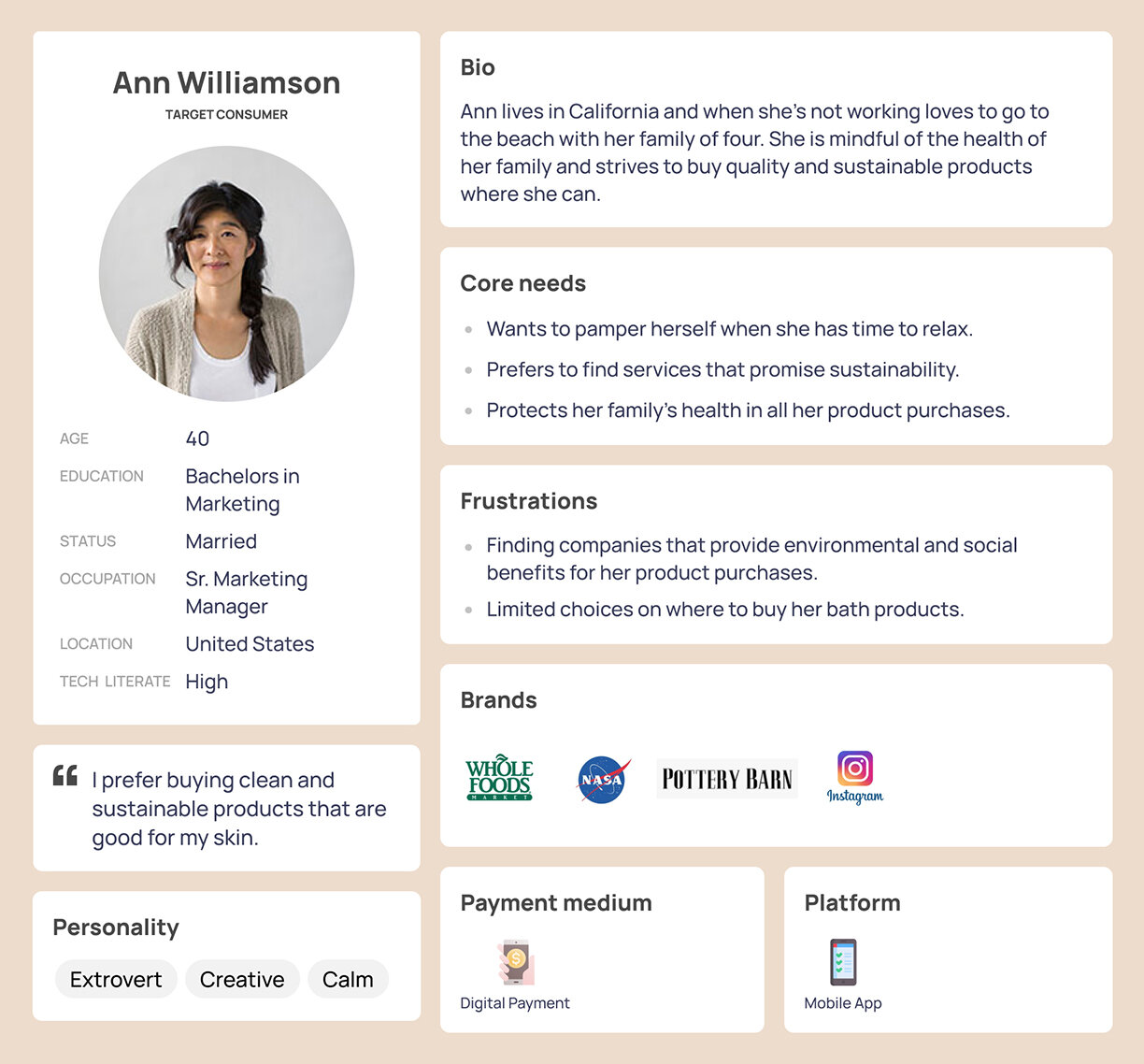
My client’s consumer was actually someone much like her: an upper middle class woman in her 40’s who is shopping for sustainable products online. I asked specific questions on what her core needs were when shopping online, what brands she likes, and the challenges she faces when shopping on her tablet and phone. I kept this research in mind during the whole design process.
From this research, two personas revealed themselves as “Ann” and “Kyle.” A deep dive into both personas are below.
Design.
The goal for the design was for it to be usable, enjoyable, useful, and equitable.
Type, Color, Personality.
I pulled colors from the developing identity created for this brand. I also created a neutral color palette from the products themselves so that the experience as a whole was visually harmonious. Color and type styles were developed with accessibility in mind.
Key Frames
Learnings.
More usability testing and research.
It’s unfortunate that my client’s product development came to a halt and I do hope this project picks back up again. In the future, I’d like to spend more time on ensuring accessibility and equity for everyone who uses this app. I’d like to do more qualitative usability research to ensure an experience that is even more useful and enjoyable for the end user.


